Showing posts with label Apparel Arts. Show all posts

Friday, June 21, 2013

Gentlemen of Style – Men’s Fashion Illustrations in the US in the Thirties

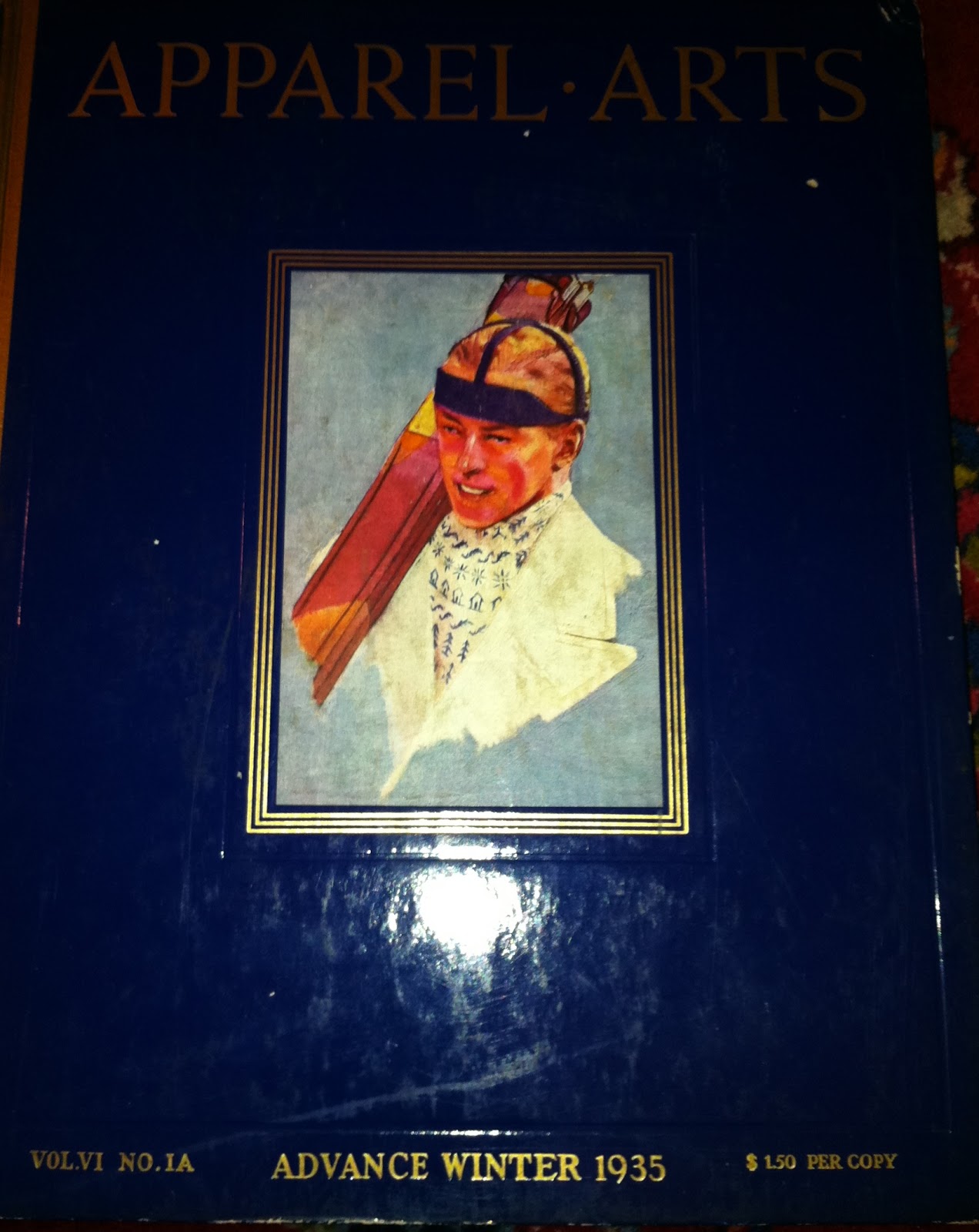
If my CasaMinimus was on fire, after I got Roxanne Burgess dressed and out the door, one of the next things I’d grab and sling off the balcony would be my cache of Apparel Arts books. The MSRP on those babies just keeps getting higher.
Oh, and I reckon the next thing I’d grab would be my copy of that twee little distillation of a book that Woody Hochswender wrote…Men in Style: The Golden Age of Fashion from Esquire. Reason is that the little Woody book is going for close to three-hundred bucks! Crazy. Don't believe me, check for your damn self. I don't care. If anybody wants my Woody book, I'll sell it to you for two-fiddy. If ya just lookin' for woody, well.
Photo of SRS by my friend Rose Callahan of Dandy Portraits fame who  has never bothered to take a photo of my dandified ass. 
Well our man Sven Raphael Schneider has done all of us a favor by creating a digital compilation of some of the best of the best of Apparel Arts visual treats. Gentlemen of Style – Men’s Fashion Illustrations in the US in the Thirties is Raphael’s eBook creation and it is hands down better than the Woody book and the pdf costs you nothing.  Here, I’ll let him tell you about it and you can go here to get it. Just sign up for his newsletter and he’ll send you a link for downloading the eBook.
“Over the past weeks, we have published fewer articles because we were working on our very first eBook – Gentlemen of Style. This book focuses on men’s clothing in the US in the 1930′s as worn by elegant Gentleman using Apparel Arts Fashion Illustrations from Fellows, Saalburg, Oxner, Hurd etc.

The goal of this book was to show the degree of elegance in men’s clothing at the time, and to point out things that you may improve in your very own outfits. Overall, I discussed more than 30 fashion illustrations from the early 1930′s Apparel Arts magazines, most of which have never appeared online anywhere.

Moreover, these illustrations are large unlike the tiny pics you usually see. In combination with the commentary, it is more details than the book Men in Style and features considerably more information about the golden age of menswear  the 1930′s.

Best of all, instead of spending $200 – 600 on Men in Style, my book will be available exclusively to subscribers to the Gentleman’s Gazette Newsletter for a limited time for free.”
Onward. Friday-ish. Gettin' ready for my Dandy Portrait. Rose? Oh Rose?


ADG II

Monday, February 20, 2012

Gabardine-My Final Words

Ok, let me finish up my gabardine ramble so we can move on this week, to even less pertinent drivel. Color and fabric quality/weight should finish this thang off. So what about fabric quality and weight? A mediocre quality flannel when brand new, might veil a good bit of its inferiority for the first three months of domicility at your house. Thereafter it begins to pill and stretch and take on a Robert Hall half-price droopiness. Not the same for gabardine. The thicker, less high-twist stuff looks like sh_t from the get-go. Two f-stops down from the very best and you’ve got a polyester looking thing with a bad case of jaundice.
I know this first-hand. My initial foray into the Ralph Lauren Custom Order Swatch Box back around 1985 landed me on the least expensive tan gabardine offering in the line-up. And I bit. During the eight weeks or so before it arrived, I had visions of wearing this two-three rolled, notch lapelled, Colony model trouser (the Colony model was great—high waisted, side tabbed really full legged trouser—think Astaire in the ‘30’s) with a crisp white shirt and a Polo paisley madder tie of mostly yellow and blue. If you can dream it, you can do it. And I was dreaming of something akin to the Apparel Arts gab above.
It rolled in sometime that July and I, brown as a berry from the poolside antics of said time, went over to Brittons on Main Street to see this, my first every anything not-off-the-peg. My dream didn’t turn immediately into a nightmare—I was too naïve to think that the suit couldn’t be salvaged…aesthetics wise. I looked at the little acronym bracelet that I wore back then. WWMOFD? (“What Would Merkin Or Flusser Do?) It then dawned on me that these two sartorial icons, both of whom I’d cross paths with in later years, wouldn’t have done such a thang in the first place.
One of the stalwart sales legends of Brittons during the time kinda chuckled as yet another of the patinated old sales fellas was marking the trousers and allowed that …“It does make you look kinda yaller.” Thanks. My investment of six hundred and eighty dollars (might as well have been two thousand for me at the time) began to feel weighty. No surprise there though. When you select literally, the least expensive swatch in the Made to Measure Box, Super 140’s it ain’t. This was probably a Super 8 at best. I might as well have had on my Senior Prom yellow tuxedo.
A buttery ultra-luxurious best of class gabardine would have trudged through the South Carolina summer in as good a form as poplin or seersucker. But my gabardine folly was a warp-weft convectionator. I soldiered on and tried to make use of it that summer but it ended up doing more time in my closet than on the mean streets and teachings hospitals of Columbia South Carolina and Augusta Georgia. I even tried wearing the trousers with a navy blazer but this too was for naught. I was then convectionated from the waist down which was just as bad. The photo above depicts a double knit polyester aberration from the mid 1970’s. It looks perilously close but less yellow, to my boondoggle.
So I tucked it away and didn’t resurrect it until I moved to New Jersey for my corporate indenture about a year later. It took no time for my peers to hang a moniker on my two-ton gabardine sandwich sign of a suit. And it was a sandwich sign—the antithesis of the lilting, flowing brook-like qualities of the good stuff. There were no cataracts of buttery fabric bunching up in the crook of my elbow when thoughtfully; I posed with chin on palm. (Cut me a break. I was a kid trying to be corporate) Instead, I was encased. Encased in what was to be known as The Rubber Suit. And it never again saw the light of day.

Now let’s talk about gabardine color choices for a moment. If you stick solely within the tan-neutral range, it’s tricky. Anything outside of it and you are more often than not, headed for trouble. Even the most sartorially advanced would do well to seek guidance on selecting a shade within the tan-neutral range and certainly so when venturing outside. Admittedly, I bring a little bit of personal trauma to this issue.
"What’s the big whoop ADG? I’ve seen enough Apparel Arts tan gabardine renditions and a photo or two here and there. All I’d need to do is point to one of those and have my tailor duplicate all aspects therein.” Remember, I made a huge mistake both in material quality/weight and in color. And if you visit a reputable tailor, the gabardine swatch book will have fifteen shades in the tan-neutral dugout.
Without knowing anyone’s skin tone as context, I’d recommend leaning towards the olive and brownish end of the scale. You can move an f-stop or two in that direction and still posses what would be considered a “tan gabardine” contrivance. I just fear the banana. The suit above isn’t gabardine; it’s a Flusser tropical wool tan of another twist. But if I tried to gabardine it again, this would be the color realm I’d feel comfortable in.
And finally, if you are feeling a bit adventurous within the tan-neutral realm, there’s a rather pinkish color of tan gab that’s really great. Seriously. Just as with the olive-brownish anchor, a pinkish version offers just enough fuzzy je ne sais quoi (“I be damn if I know” for you South Carolinians) to make the rig interesting. Just don’t overstep your sais quoi en route to the pink side or people will say of you what Tom Buchanan said of Gatsby (In the movie-not the book…the profanity was added to the screenplay) Jordan Baker: “He's an Oxford man.” Tom Buchanan: “Like hell he is, he wears a goddamn pink suit!”
So what about other colors? There are a few that seem to sing gabardine but I’m not in possession of fuzzy enough stones to try ‘em. I do have a stellar pair of ultra-lightweight Flusser trou in olive but I was too scared to go the whole suit. And my Polo Ralph light cream gabs (above) for summer are truly harmless.

Will over at A Suitable Wardrobe mentioned at one time, an interest in gray gabardine. Here’s my May 15, 2011 comment on the matter that I left over at his blog… ADG said...“I've never been able to find any gabardine shades other than tans, that seem "right" to me. Flusser had a pearl gray dupioni silk about ten years ago that was at first unsettling to the eye but made up, to me, a lovely suit. (Not for me) I suspect the same outcome once you find something (in gabardine) that suits you.”
And the Fluss did offer in a seasonal campaign several years ago, a stunning steel blue gabardine that surely made-up to be a stalwart display of gabardaciousness. Just not for me.

The final gabardine chapter, at least from ADG II, is now closed. I’ve either intrigued you enough to go and finger the silky leaves of your tailor’s gabardine swatch book or I’ve scared you off the idea completely. Either way, it’s probably a good thing.

Onward. In at the moment, Brooks Brethren Flannel Pajamas. (Pyjamas for you South Carolinians)

ADG II


Thursday, October 20, 2011

Laurence Fellows

Certainly there were other talented and noteworthy illustrators for Esquire and Apparel Arts. But those of us who are clothes nuts…sartorial history buffs…devotees of the drapy era of men’s clothing when waist suppression and higher button stances were de rigueur…default to Laurence Fellows’ as the illustrator of note.
But who was he? Here’s an excerpt from Walt Reed’s write up on Fellows…
“…showcased the talents of such major illustrators as Charles Dana Gibson, James Montgomery Flagg, Orson Lowell, T.S. Sullivan, Peter Newell, Art Young, and many others who mirrored the country's foibles in their enthusiastic ridicule. 
Joining the group in the early teens was an ultra-sophisticated young artist named Laurence Fellows. A native of Pennsylvania, Fellows had received his training at the Philadelphia Academy of Art, with several follow-up years studying in England and in France at the Academie Julien under J.P. Laurens.
 Upon his return to the United States, Fellows' fresh point of view, particularly reflecting a French/Vogue influence, found him a ready audience. His style was distinguished by a thin outline, flat tonality or color, with the emphasis on shapes rather than details. Just as quickly, however, he acquired many imitators. Before John Held, Jr., for instance, had invented his "flapper," he was clearly adapting much from Fellows' mannered drawing style into his own submitted gags. Other new converts were Hal Burroughs, Bertram Hartman, and Ralph Barton, who would each run with it in their own way. Fellows particularly liked to play with off-balanced compositions, even in the more conservative arena of illustration for advertising.
One of his early commercial clients was Kelly-Springfield Tires, which gave him the opportunity to combine his elegant draftsmanship with the clever, humorous copy depreciating the competition, thus often violating the rule against "negative" advertising. But Fellows' drawing and the copy had an edge of good humor that attracted a national following and the successful campaign lasted for many years.
In the thirties, Fellows gradually shifted his emphasis to fashion art, including both men and women, finding clients in Vanity Fair, Vogue, Cosmopolitan, The American Magazine, and McClure's. He also became a regular contributor to Apparel Arts magazine. 
With only a limited number of men's fashion artists available, Fellows was most in demand for the male-focused subjects, particularly by the newly launched Esquire magazine in the thirties, where he was regularly featured in full-color spreads for many years…
So this guy Fellows? What did he look like? Was he as sartorially bulletproof as his subjects? I found totally by accident, a group photo recently that included a twenty-six year old Fellows. Here below is the group shot and caption.
"Unknown photographer: A Group of Young American Artists of the Modern School (from left to right: Jo Davidson, Edward Steichen, Arthur B. Carles, John Marin; back: Marsden Hartley, Laurence Fellows), c. 1911."
 And here’s Fellows. I’ve got a trove of Apparel Arts books and other sources containing Fellows’ illustrations. But my goal is to one day own one of Fellows’ original watercolors. Keep your eyes peeled on my behalf.

Onward.
ADG II