I'd just missed him at Alan Flusser's atelier one afternoon. And a few years before that I fingered one of his white jackets on a hangar at Vincent Nicolosi's flourescently intimidating workshop.
I wrote him a letter many years ago. And he wrote me back. If the house was on fire, my Wolfe letter would be one of the first things I'd grab.
His radioactive lexicon suited the hell out of me and I absolutely loved what his words made my imagination do. He'd almost put my mind's eye out sometimes.
And he was Southern. And reviled by Norman Mailer.
R.I.P. Tom Wolfe
“Style anthropology can explicate a lot of otherwise tricky issues, in some cultures probably more than others. Sort of Like Water For Chocolate, only Weejuns...” LPC
Showing posts with label Tom Wolfe. Show all posts
Tuesday, May 15, 2018
Wednesday, December 19, 2012
Better Days: Tom Wolfe on Richard Merkin—1992
It’s no secret that I love Tom
Wolfe and loved Richard Merkin. Well, actually, I still love Richard Merkin.
There’s enough of Richard on my walls and in my sartorial literature files for
me to consider him still here.
I love Tom Wolfe’s dandified
cocksurety – his Southern lilted verbal aplomb when gracefully responding to
such charges as his novels aren't really novels and indictments that cry "for
God’s sake man, get a better f_cking editor." I won’t characterize Wolfe’s posture and
conversation as self-deprecating because it isn't Here’s my take—Wolfe has an
ivory, tight-twist gabardine swathed, steely, courteous elegance. With a scant
lisp.
And then we have Wolfe’s great personal friend, Merkin. If I was ever limited to one depiction of Merkin, it would be Alan Flusser’s take on the
multifaceted flâneur…and I paraphrase loosely here because I’m too lazy to walk
across the room and pull the reference. But Alan said that “coming upon Merkin
on the street is like walking through a Bazaar in Marrakesh. You don’t know what
to look at first!” Bam. I mean really. Merkin was Brooklyn and Coney Island to
Wolfe’s Richmond and Yes Ma’am No Ma’am.
Both may be assigned to the
Sartorial Dandy Pantheon but their nomination dossiers, while equal in content,
would be thematically opposite. The case for Wolfe’s membership would be firmly
affixed to an unwavering, off-white, monochromatic gaggle of forensics.
Merkin’s
on the other hand, wouldn’t be firmly affixed to a damn thing – At least not
one singularly thematic thing. His bipolar variance in color, texture, epoch
and melody made my fuzzy-ass closet look like a storage rack of identical burgundy choir robes. I’d reckon
that Merkin’s folder would surely contain his own words when he posited that
his sartorial style was “somewhere between the Duke of Windsor and the Duke of
Ellington.”
Photo from Rose Callahan's Dandy Portraits |
And I just think it’s cool
as hell to have friends—true friends—those anything but Facebook defined
friends—you know—the ones who would come get you at three in the morning. Well
that was Merkin and Wolfe. I borrowed from Rose Callahan, this photo of Merkin, Wolfe and their other great friend, lawyer Eddie Hayes.
I’m always on the lookout for
Merkin ephemera...having all of his GQ columns that he wrote over twenty years
ago and of course, the treasures that his widow, Heather, sent me after
Merkin died. And recently I came across a few
exhibition catalogues from Merkin's gallery shows back in the early 1990’s. And
much to my delight, Tom Wolfe wrote the introduction to the Helander Galleries’
1992 Merkin show, Better Days. Unlike you high-minded, copy
editors-in-another-life, critics of Wolfe’s words,I, the verbose lexiconical
rambler my-damn-self, would read Wolfe’s grocery lists if they were availed to
me. So reading his Helander-Merkin treatise was great fun. Shut the ___ up.
So this morning, with reverence
but without permission from Bruce Helander or others who might have copy rights
and prefer that I not transcribe Wolfe’s essay, I typed from the exhibition
catalogue, one friend’s erudite commentary on contemporary art in general, in
tandem with his more specific efforts to convey and characterize the other
friend’s art. For those who, like me,
love art and Wolfe and Merkin, I hope you enjoy reading it.
“The
paintings and pastels of Richard Merkin are part of a strain of Modernism that
is well established in England, the home of his natural brethren, R.B. Kitaj, FrancisBacon, Peter Blake Lucien Freud, Ronald Searle, Henry Lamb, Michael Andrews, StanleySpencer, and David Hockney. They are what might be called the Modernist Wits. This
creates a problem – even for Bacon – since within the art world, and especially
the American art world, Modernism and Wit are a contradiction in terms.
Merkin
like his confreres, uses various stylistic devices of Modernism; in his case,
two-dimensional pictures, solid blocks of color, abstracted shapes,
conventional contours, unshaded forms, and so-called all-over design, in which
no part of a picture has any greater weight than any other, All that is on the credit
side of the ledger up in Art Heaven, of course. But Merkin, like the other
wits, presents subject matter that violates one Modernist taboo after another.
As tout le monde, or tout lemonade d’art, knows, a picture is not supposed to
tell a little story, suggest an anecdote, be funny, make you cry or get angry,
tune up the sentimental side of your nature, illustrate the world around you, dwell
upon historical details for their journalistic or historic value, or present
likenesses for their own sake. Alas, these are sins that Wits wallow in.
The art world
will allow exceptions from time to time, the most notable being Picasso’s large
cartoon comment on the Spanish Civil War, Guernica, painting at a moment when
anti-Fascist feeling and Left sentiment had reached their apogee among European
and American intellectuals. Guernica was expressly designed to make the viewer
weep and get angry over Francisco Franco’s bombing of civilians(and will
probably be viewed by art students in the 21st century, with their
damnable detachments from the problems of our epoch, as a howler, one of the
most ludicrous pictures ever taken seriously by well-educated people). It is
worth noting that Picasso never attempted such pictorial comment again, returning
forever after to the safe and fashionable imagery of classical mythology.
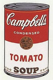
Pop Art
wasn’t even an exception. The Pop artists never illustrated the world around
them or even created their own images from it. Pop was a studio game played
within a tight set of Modernist rules, eventually codified by the Pop
Apollinaire, Lawrence Alloway. The Pop artists took their images not from life
but from art created by anonymous graphic artists and industrial designers
including flags and numbers and letters found in commercial printing fonts. Some,
such as Warhol, never did anything other than lift images directly from existing
commercial art or photographs, altering only the size and coloring, if that much.
Others did near-copies. The game, said Alloway, consisted of producing pictures
that were neither abstract nor realistic but rather had to do with “sign
systems.” There is not a single painting within the canon of Pop in which an
artist attempts his own depiction of life in the extraordinary decade in which
Pop grew up, the 1960’s.
Underlying
the Modernist stance, whether one is talking about style, content or theory, is
the belief that the great artist is a holy beast , a natural who receives
flashes, known as inspiration, straight from the godhead which is known as
Creativity. A holy beast is not a rational, calculating, analytical, and
intellectually detached person. In fact, in the Modernist view, rationality,
calculation, analysis, and detachment are detritus, impediments to creativity.
The Modernist artist is supposed to be like the Gnostic Christian, who sought
to get rid of the detritus of civilization in order to reveal the light of God
that exists at the apex of every human soul. Draftsmanship, true rendering,
perspective, and shading are all analytical undertakings. So are wit, satire
and commentary. In the Modern view these are all pieces of age-old junk that must
be thrown out.
In England
the art world – which consists of about five hundred dealers, curators,
professors, critics and artists in London, Oxford and Cambridge who determine
all matters of taste – has never been completely dominated by orthodox
Modernism. There has remained some room in which the mavericks such as Kitaj
and Bacon could cut up. But in the American art world, which consists of about
300 similar souls (some 300 of whom do not live in the New York City area)
orthodoxy is a far more solemn business.
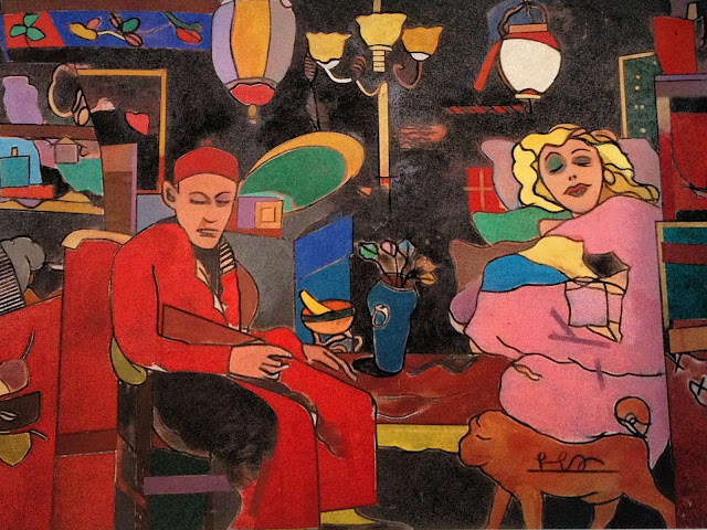
Merkin’s
very picture titles, Van Lingle Mungo’s
Havana, Our First Detective of the Broken Heart are a gob of spit in the
face of Modernist taste, since they actually describe the pictures, which are
loaded with specific historic references, and are shamelessly entertaining.
Stylistically, Merkin has been as Modern as any of the Wits. Particularly in
his Van Lingle Mungo period, the mid-1970’s, his work was rigorously
two-dimensional, his contours were highly conventionalized, his canvases were
covered edge to edge and corner to corner, with solid color shapes of equal
density, field and figure were given equal emphasis, no matter how amusing the
figures – and the figures tended, like Mungo, a one-time pitcher for theBrooklyn Dodgers, to be long gone down Funny Street. The typical Merkin picture
takes legendary American images – from baseball, the movies, fashion, Society,
tabloid crime and scandal – and mixes them with his own autobiography, often
with dream-style juxtapositions. Merkin himself is always recognizable as the
toff with the Cold Stream Guards mustache, popping up amid the romp.
In the
past he has been as much a colorist and all over designer as, say, Matisse or, to bring the matter closer
to home, Malcolm Morley, an Australian now living in the United States (who
could perhaps be included in the ranks of Modernist Wits). In his most recent
work, however, Merkin has begun to violate even the stylistic taboos. In 1990,
in paintings such as Re: Joe Stern #2,
he began to use a draftsmanship more sophisticated, more in the vein of 1920s
European satirical art, than anything allowed in the Modernist canon. In the current
show, he gives us graphic focal points such as the white figure in pith helmet
against a swath of black in Our First
Detective of the Broken Heart. The focus is re-emphasized by the use of
lines of perspective in the roof above. This is not the Modernist way.
The
truth may well be the Merkin is impossible to characterize even with a grouping
such as the Modernist Wits. The fascinating thing, in the last analysis, is not
that he is in some way like Kitaj or Bacon or Searle or Spencer of Hockney or
that the whole crowd has swum upstream – but, rather that he, like them, his
kinfolk, has managed in an age of High Orthodoxy to become that rarest of
creatures, the artist who is sui generis.”
Saturday, September 15, 2012
Saturday Morning—Words and Nothing, Really
LFG is still
asleep. I’m almost giddy amidst the phenomenon of having her here with me for
three nights in this, my incrementally devolving Casa Minimus Man Cave. She was
exhausted last night after two dance classes yesterday and her second week of
seventh grade homework. I fed her dinner…comfort food…like the old days when
she was five or six years old…baked chicken and French style green beans. She
was postprandially comatose on the sofa within minutes of finishing her dinner.
I’ll
gladly engage in my finance and transportation duties today as I shuttle LFG to
back to back dance classes and a couple of other appointments as well. Here’s
what I mentioned in an email to a friend earlier this morning… “L___is still asleep. I gave her a small dose of adult
NyQuil last night before bed. She’s got an adult sounding rattle in her chest.
It’s been so long since I’ve had her here, in Old Town, for three consecutive
days…I’m reveling in it…even though I’m essentially doing the transport to
dance classes thing for the most part. I’m just a completely different and
frankly, better person when I’m with my child. I think you know what I’m
saying. Only parents can understand that phenomenon.”
I don’t give marital or child rearing advice as a general rule. But I’ve come
to the following so take it for what it’s worth—Either have zero kids or more
than one.
I’m
still smarting from having to miss the F.I.T. Ivy Style opening reception last
night. I gladly accepted the invitation to join all of the Trad-Prep-Ivy
devotees when the reception was originally scheduled for last Tuesday night. I’d
already booked my train to Gotham when I got an email informing everyone that
at the last minute they were moving it to last night. I don’t subordinate my
LFG opportunities to anything, including what I’m sure woulda been a fun get
together at F.I.T. It pained me to do so but a few years ago, I had to decline
the opportunity to spend an evening with Tom Wolfe and my friend Alan Flusser
at the Rhode Island School of Design’s evening gala honoring the late, great
Richard Merkin. I don’t subordinate my LFG opportunities to anything.
Words.
Read this…“Blackberry jam is my Proust's
madeleine - one lick of the knife and I am eight years old again, devouring
slightly burnt toast with a slab of cold butter and a seed-flecked puddle of
complete heaven.” Go over to MonAvis, Mes Amis and read more of it. I mean shit…if I could write anything
without profanity and sans photos and actually have people read it, then I’d
call myself a writer. Shut up.
Words…Randomanalia and Butcept long ago became two of my faves here in blogland…to the
point that when I announced my blogging cessation, Yankee Whiskey Papa and Giuseppe
declared that they wanted the rights to them. But for some reason, they eschewed
any interest in Shut up. Now that I
think of it, I believe that I stole Randomanalia from Lime Green Girl. But this
morning my keyboard flicks contrived one that I think’s gonna be a keeper for
me. Irreleventia. Kinda sums it all
up for me.
Onward.
Awaiting a Shell Cordovan experience on Monday that’s gonna be big. One way or
the other. There will be no middle ground on this one. I’ll either be preening
or hiding.
ADG-Two
Wednesday, September 22, 2010
Tennis Whites-A Protracted Discourse.
I like the decorum associated with white. Mark Twain seemed jaunty while swathed in it. There was a time when as a kid, I'd have to wear whites on the municipal courts in my hometown. Shut up.
Dr. W.G. Grace carried off the Cricket Whites scheme in good form. He’d have probably looked swell in a white General Practitioners jacket but the calling of G.P. was trumped by the cricket pitch. Not sure that he ever really practiced medicine. I am sure that he and Lord Hawke both refrained from entering the pitch in the same moment that professionals...you know...men who played for a wage...emerged.
Tom Wolfe revels in pissing people off with white elegance. His counter-bohemianism in full.
And look at this guy. Toad has never looked more regal than this. What kind of shoes did you have on?
The U.S. Open would be marginally more elegant if a tennis whites only rule was in place…for players and officials. This poor lady redefines high waisted trouser induced celibacy. These trousers on a woman, coupled with either Crocs or Birkenstocks would pretty much seal the deal for me.
And sorry about the foot fault controversy Andy. Might the outcome have been different if you'da cleaned up a bit and donned maybe...whites? Whitey.
But would tennis whites influence crowd behavior? Tennis seemed to be one of the last bastions of “no fist-fights in the stands.” That would be until this punk decided to cock off on a seventy something year old man. The man was protecting the honor of his daughter—nothing more than I would do for LFG. Shameful. Granted, they were all a bit on the rough side...way up in the nosebleed realm but still...no excuse.
So here’s a trip down tennis whites memory lane. What a fun looking bunch. They left shortly after this photo was taken and headed over to Hooters to drink beer and eat wings.
Renee and Roger. France and Switzerland. Ashford and Simpson. Laurel and Hardy. Mickey and Minnie. Adam and Eve. Bill and Hillary. Starsky and Hutch. Hansel and Gretel. All of them would have looked fetching in white. Shut up. I'm bored.
I have nothing to say here. Nothing. Not a damn thing. Now give me a cigarette.
If you don't believe that physical power is the core strategy of sisters Williams, then go read The Art of War or something silly like that.
This is Tintin. And his older brother Stinky.
Fred Perry
Tony Trabert
And please. Let's just end this drivel with a stunning example of physicality. Nancy Kulp...better known as Jane Hathaway on The Beverly Hillbillies.
Onward... A.Whitey G.
Thursday, August 26, 2010
The Pinned vs. Clipped Collar: A Protracted Discourse
Clip on collar pins are like clip on ties and clip on suspenders. Under no circumstances shall anyone over the age of nine utilize these sartorial aberrations. Either impale your collar or leave it sans girding. Skewer it or let it be. Impale the cloth or anchor that collar through its pre-sewn eyelets. Take a cue from aplomb master Astaire.
Why? Because the difference between a pinned-through collar and one anchored by some type of slide-on ditty is like being seated in the Cub Room at the Stork Club versus Sherman Billingsley ordering you and your party to Stork Siberia. Clip-on slide-on and your collar will be relegated to the cheap seats. Let me say it another way. Anything other than pinned-through shouts sartorial rookie. Poseur is too strong and frankly, an unfair characterization but plebe certainly isn’t. Here’s Papa pinned nicely in the Cub Room
Here's Astaire again...and he's pinned this point collar to perfection. I’ll touch on collar types and the damage pins inflict so sit tight. Astaire also tarted up his shirtsleeve nicely with an inconsequential monogram. The point collar just takes to the pin better than any other collar style.
Australian pilot Sir Norman Brearly was known to pin it down before taking to the skies. I’d love to live in a world where half this level of sartorial precision was the norm.
Frank’s sartorial acumen was unimpeachable. However, I’ll use his pinned collar example to make a point about club or rounded collars. Once you pin them, the already modest collar essentially disappears. The resultant look is, at least to me, a bit underpowered. It’s “off” in some way and ends up looking like the antithesis of the anchored aplomb of the Astaire point collar. Sinatra also appears to be wearing a collar with sewn-in holes for said collar impalement. I’ll take that issue up in a moment as well.
Here’s George Frazier pinned to perfection. Surely he would cut you down to size if he discovered you sporting a clip on anything. I suspect for Frazier it was either a Brooks Brothers oh-so-properly rolled button down or it was a point collar pinned to perfection. And God help you if you wore a carnation and a pocket square.
Let’s bring Wolfe and Merkin into the fray. Obviously the issue of collar girding was one of significant import for both of these dandies. In Wolfe’s dedication of The Right Stuff to Merkin, he mentions not only the collar pin issue but a Frazier corollary of some sort.
Ok, so let’s talk hardware. While some may spend significant bucks on collar pins I never will. I buy the gold and silver plated ones at Paul Stuart because I’m prone to lose them. And who the hell’s gonna know the provenance and alloy content of your collar pin? Those that I allow to get that close to me are already so rapt in Maxminimus Fuzzy Aplomb that they could give two hoots and a damn regarding the hardware that they are about to relieve me of. Shut up. I mean it. Shut up. The pin at the top is exclusively for shirts that have preset-sewn-in holes. I no longer own any of those shirts so if anyone does, send me an email and I’ll drop this one in the mail to you. You need to buy pins like the second one.
I don’t like the pre-drilled collar holes because their placement demands that you tie your tie a certain size to accommodate the un-editable space created by the pinned collar. Some ties result in smaller knots based on weight and type of material. And if the entire rig isn’t cinched with air-tight z-e-r-o space showing around and below the knot...the result is loose and sloppy-exactly the antithesis of what the pinning-girding effort should yield. The picture above that I nicked from a website illustrates my point. Everything looks nice. The suit, the shirt, the tie…nice choices. But the screw-on collar bar leaves way too much space around the rig.
Now let’s take up the issue of sequelae…collar trauma. Folks, it’s the price of doing business. Yes, the pin-through ritual will take a toll on your shirts. But either accept this and concede it or don’t wear pinned collars. Nothing more to say here. Take comfort in the fact that when laundered, the pin holes generally heal and that only after years and years of use will the collar look too buck-shot and thus require retirement. Here are examples from my closet. Keep in mind that all three of these shirts are at least fifteen years old—the Brethren end-on-end was made in the USA so that tells you something about its age.
End on end probably takes more of an irreparable hit than other fabrics. Keep in mind though, that even after years of wearing this shirt and the resulting scars, I still wear it and once it's pinned again, all of the battle scars seem to fade into the overall assemblage.
A slightly less traumatized Paul Stuart example.
And I stopped pinning this Flusser shirt from fifteen years ago so the damage is minimal. I don't like how small and incorrect these club collars seem post-pinning.
So here’s the ADG interpretation of collar pinning done right. Airtight and snug. Also realize that this is a hybrid collar. It offers the circularity of a club collar but with rounded collar points that remain pronounced amidst its pinned-collar harness.
Of course it wouldn’t be an ADG post without at least one fuzzy iPhone picture. So here you have the balance of the rig that shrouded the impale-ee.
Fuzzy completeness manifests via the Toad of Toad Hall Man of No Consequence Monogram. Opposite the 5th button. Shut the……
So if you can’t run with the pinned-through dogs, I suggest you keep your clip-on ass on the porch.
Onward. Pinned. Woof-woof.
ADG
Subscribe to:
Posts (Atom)